monkcommerce.com
About Monk - The app has a simple goal: to help your store drive incremental sales with a measurable ROI. Use the app to show all kinds of offers, recommendations & nudges across the buying journey right from the product pages to cart to post checkout.
Customize the look and feel of your popups/widgets (+translate text) exactly as you want & use our robust eligibility system to create highly targeted buyer experiences. The app is also compatible with Shopify Markets & stores using multiple currencies.
The primary objective was to design the MVP for the B2B eCommerce app with keeping scalability of core features in mind. Being the only designer in the team, I collaborated with Product, Marketing and Developing teams to work on Merchant side Dashboard, User Side Pop Up and Product Onboarding.
User and Market Research
Since we were building a product to launch in the European market. We wanted to understand the user behavior and how competitors are doing in the space.
Based on the research, we found the following insights
User Analysis
70 percent eCommerce stores on Shopify offer clothing and jewllery
67 percent users do window shopping and impulse purchases
57 percent people purchase if given discount on the products in their shopping cart
88 percent people love detailed but clean eCommerce stores
Insights
Themes can be designed using these points in mind
Creating Urgency will help here - e.g. using timer
Additional Discounts on cart pages
Design user centric and clean interfaces.
Market Analysis
Based on the market research, these are the few key insights about the existing players in the market, in terms of their usability, user experience and features.
Insights
Top competitors provided Multiple Triggers for the offers (Product Page, Cart Page, Post Purchase).
40 percent App provided Specialized solutions for example - Post Purchase customizable offers only.
30 Percent high performing solution had customizable offer pop-ups.
Working towards the solution
There were 3 sectors which needs to be designed - Funnel Form, User Side Pop Up and Merchant Side Dashboard.
Grid System
Since the dashboard will be integrated with the Shopify, the usable screen dimensions were - 1440px by 784px. I selected 8 column grid with 20px as gutter and 254px as margin.

Funnel Form Design
We have designed a 3-step funnel form, which enables users to create and integrate a offer pop up on their store.
Scalable Designs
The app's core feature revolves around offering offer integrations in pop-ups or bundles. While creating, I have used customizable and scalable components.

Customizable designs
Based upon the competitor's research insights, easily customizable
Integrability will be one of the critical metrics for the B2B product.
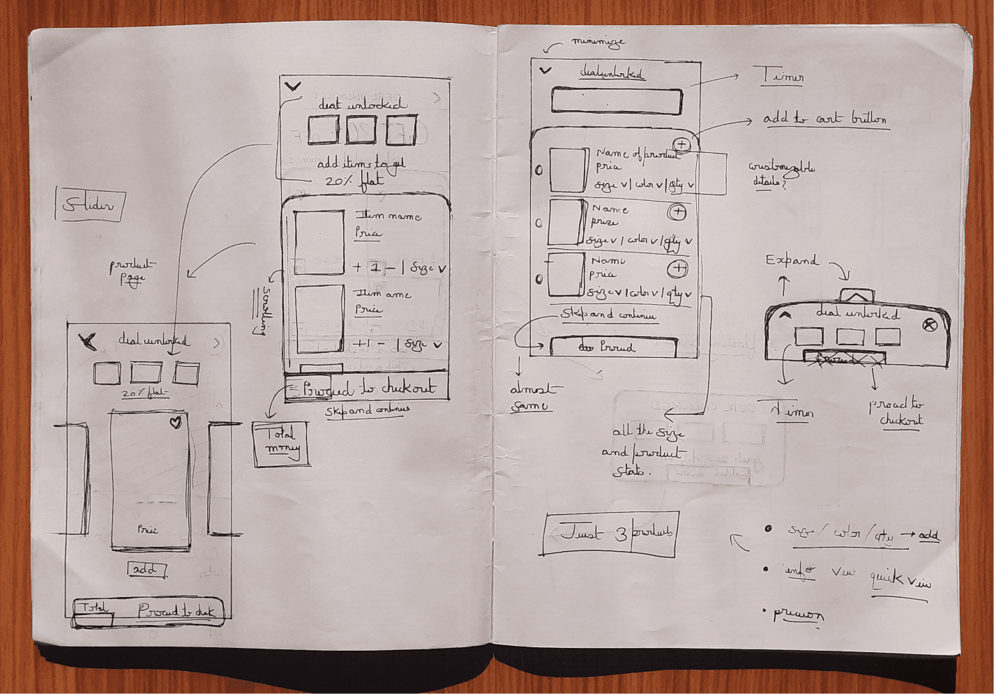
User Side Pop-up
These pop-ups will be shown on the merchant's website. Using Monk, a merchant can set up various offer funnels and fully customize them.
Merchant dashboard
Merchants can track and see the conversions of all the various funnels. Can create a new funnel to launch and increase AOV.

Project — Monk Commerce
Next Case Study
Project timeline
Company


