Project — Design system components


upraised.co
Project Duration
Jan - Nov 2023
Role
Product Designer
Collaborators


Upraised, India's upskilling Ed-tech platform for product management roles, operates in a cohort format—guiding users through Learning, Interviews, and Job placement.
This was an ongoing project where our design team made significant contributions to shaping our design system. This involved establishing foundations such as typography, colour, spacing, etc., building components, and refining branding.
I'll now detail some of the design system components I developed from scratch.
Why work on Design systems?
Design system is an integral catalyst in design and development process, it takes care of primitive design decisions and improves efficiency.
Timeline at Glance
2022
Nov
How is the
process of designing components?
Research: Collect context to define the component's purpose and identify potential use cases.
Properties: Based on the definition and use cases, begin outlining variations and properties.
Design and Test: Develop designs and test them across various interfaces and scenarios.
Code: Ensure scalability by writing in the code.
Buttons
A button is a control element that initialises an action on interacting with it. We segregate buttons based on hierarchy by styles, hierarchy by sizes, states, colour, variants.
To determine the button size, I conducted a brief research across different interfaces.

On the basis of analysis, I concluded the following as the size for initial versions of the buttons

The Live version of button -

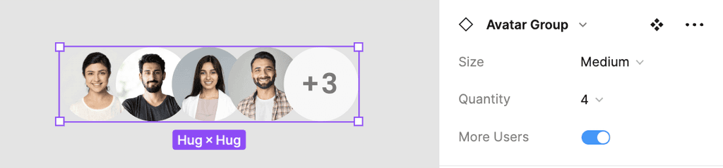
Avatars
Avatars, fundamentally are manifestation of a person or an entity. In the world of interfaces, the manifestations are in the forms of visuals representing users. They act as the user's identity.
The live version of Avatars -

The live version of Avatar Group -
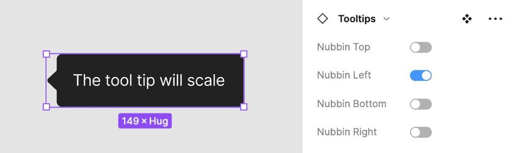
Tooltips
Tooltips are text based elements which provide more context about the interface. They provide descriptions or explanations for their paired element, are highly contextual and specific to the paired element.
The live version of Tooltips -
Alerts
Alerts are either user or system generated notifications, which needs be manually resolved or dismiss by the user. They are moderately obtrusive on the interface.
The live version of Alerts -

Toasts
Toasts are the design elements which gives users immediate feedback after taking some action from the system or user. They are unobtrusive, non-modal and expire automatically.
The live version of Toasts -


Next Case Study
Project timeline
Company
